Whanaungatanga

Our first-term school value is Whanaungatanga.

Whanaungatanga is about developing respectful, mutual kinship-type relationships. It helps us communicate with others and build good relationships. This value involves caring for others and the well-being of you and the people around you.

As a fellow student of the school, I can demonstrate the value of Whanaungatanga by:

  • Hanging out with friends during lunch and morning tea.
  • Planning an outing or an after-school hangout with them to further build and strengthen our friendship.
  • Keeping contact with friends such as my international buddies during my stay in this school.

Everyone can demonstrate Whanaungatanga by doing the following:

  • Share your own experiences, ideas, and resources, and actively collaborate with others to achieve common goals.
  • Be respectful of diverse perspectives, cultures, and backgrounds, and show empathy for others’ experiences.
  • Promote a sense of unity and togetherness by working collaboratively towards common goals and celebrating successes together.

Trial Iron-on Transfers

Introduction:

Coming from one of the designs that I have made previously from two different applications (Adobe Illustrator and Adobe Photoshop), I want to see if I could possibly transfer them into an object made of fabric like Tote bags, etc.

Trial Details:

To determine the effectiveness of using Iron-on transfer paper when transferring designs from paper, I will be assessing the trial result to the requirements listed below:

  • Image Quality – Is the image on the fabric clear and detailed just like what it was in the original image?
  • Color Accuracy – Compare the original image to the transferred one. Has the color maintained its consistency and accuracy?
  • Adhesion How well does the design adhere to the fabric?

Trial Steps:

1. Prepare for printing. Before I start printing, I need to get the materials that I am going to need when doing the iron-on transfer. The materials that I am going to be needing are fabric and iron-on transfer paper.

2. Create a mirror image from the original image of the design. For the print and the text to appear correctly, I need to mirror, flip horizontally, or reverse the image on the application or print job settings.

3. Using a printer, print out the transfer. Before I use the Iron-on Transfer paper, I will first try it on plain paper to make sure that the quality is satisfactory. During the printing of the Iron-on Transfer paper, I need to make sure that the paper size is set on “Letter” and the print quality to the best one.

4. Apply the transfer to the fabric. Firstly, I need to prepare an ironing surface. Next, I will preheat the iron to the highest cotton setting and make sure not to use steam. Then with firm pressure moved the iron up and down until I fully ironed the whole paper. Finally, I will wait 3-5 minutes for the paper to cool down before peeling it off the fabric.

5. Gently peel away a corner of the paper backing. I need to be gentle at this part to prevent any damage to the design.

Trial Result:


Printing Details:

Paper type: Photo Paper

Quality: High or Best

Conclusion:

For this trial, I have tried the transfer-on paper on two different fabrics.

  • The first one, I tried it on a white, thin fabric; the result for this trial is the right photo. When transferring a design onto a smooth and thin fabric, it is much easier and quicker. However, when printing the design, I forgot to mirror the image which is why the design on the fabric is inverted.
  • On my second attempt for this trial, I took note of every mistake I made on attempt #1. This time I made sure that when printing the design, I inverted the image of the design. Compared to the first one, this one took longer to transfer because the fabric itself is thick and rough which makes it a bit harder for the design on the transfer-on paper to transfer. I had to continuously press the paper onto the fabric for approximately 4 minutes. Although the paper has accurately transferred the design details of the original image to the paper, the color itself looks different because the fabric has a dirty white color which affects the color of the transferred design as it makes the colors look darker compared to the original design image.

Overall, I can say that using this paper is a great tool to transfer design onto fabrics. You can make and transfer designs for t-shirts, tote bags, etc. Transfering the design was easier than I thought as I did not have any difficulties or failed attempts when I was ironing the transfer-on paper to the fabric. The design itself adheres to the fabric really well which I think would be a great advantage when using this paper.

Trial Button Press

Introduction:

Now that I have made the logo design for my cat cafe, I am going to trial the effectiveness of the button press for creating badges with the logo design that I have created in Adobe Illustrator.

Trial Details:

For this trial, I am going to evaluate the following:

  • Clarity and Detail – Has the design been transferred well onto the badge?
  • Color Accuracy – Is the color of the original image and the one in the badge similar?
  • Ease of Use – Is the machine quick and easy to use?

Equipments:

  • Button Press Machine
  • Button Parts
  • Circle cutter
  • Transparent Plastic Films

Trial Steps:

>>>>>>>>>>>>>>>>>>


1. Print out the image of the design for the badge and cut it to the proper size using the simple and efficient circle cutter punch press. I am going to use the logo design that I have made previously in Adobe Illustrator.

>>>>>>>>>>>>>>>>>>

2. On the Button Machine, I will first put the metal cover on theA” mold.

>>>>>>>>>>>>>>>>>>

3. I will put the chosen picture on the metal cover, and then put the plastic film.

>>>>>>>>>>>>>>>>>>

4. I will rotate mold “A” to make it directly below mold “C“.

>>>>>>>>>>>>>>>>>>

5. I have to ensure that the support pin is against the rounded plate and cannot pass through the hole on the side.

>>>>>>>>>>>>>>>>>>

6. I must press the handle until I hear a sound; When I hear the sound, that is when I can raise the handle.

>>>>>>>>>>>>>>>>>>

7. At this stage, I will notice that the metal cover is already within the mold shown above.


>>>>>>>>>>>>>>>>>>

8. I will then put the button back cover into mold “B” following the correct placement that is shown in the picture above.


>>>>>>>>>>>>>>>>>>

9. I will rotate mold “B” until it is directly under mold “C“. Furthermore, I need to make sure that the support pin passes through the holes in the circular plate.

>>>>>>>>>>>>>>>>>>

10. Like what is shown in the picture, I will press the handle once again.

>>>>>>>>>>>>>>>>>>

11. After the last press, I will be left with the button with the print design that I have chosen for the badge.

Trial Result:

Conclusion:

Looking at the result, I can say that the button-press machine has transferred the design well onto the badge. The details and color are similar to those in the original photo. In terms of ease of use, the machine itself was a challenge as I failed 3 to 4 times. This is because I discovered that you have to press all the way down when I do step number 10. Overall, the button-press machine is a tool for creating badges as it can easily transfer the design onto the badge. In addition, failures may happen just like what happened to me but you’ll naturally get used to the machine and successfully transfer the design onto the badges.

Trial Adobe Photoshop

Introduction:

After evaluating this application, I have concluded that it is suitable for creating posters. For this section, I will be trialing to see if Adobe Photoshop is ideal for creating an advertisement poster.

Trial Details:

For this trial, I am going to be creating an advertisement poster for my cat cafe business as one of my digital outcomes for this standard. When conducting this trial I will be making sure to consider the requirements and specifications that I had listed in the presentation. These are the following:

Requirements:

  • Eye-Catching – The poster itself must be visually appealing so that it would grab people’s attention to the cafe.
  • Clear Message – it should convey the cat cafes selling point and encourage people to come in the store.
  • Consistency – Again, the design of the poster must align with the cat theme of the business which is the main thing.
  • Call to Action – Includes a strong call to action to the people by using catchy slogans.

Specifications:

  • Ad posters require a 5mm bleed.
  • Resolutions should be 300 dpi.
  • All colors should be CMYK.

Furthermore, the equipment to be used for this trial is the following:

  • Adobe Photoshop (subscription)
  • Milanote
  • Pinterest

Trial Steps:

——————

1. Visualize ideas in a mood board using Milanote. Before I create my poster, I think it is best if I create a mood board. Doing this can help me visualize my ideas in an organized layout which would help me develop the style, vibe, and color palette of the advertisement poster. Furthermore, the images that I will be using in this trial are from the app Pinterest.


Develop Ideas on Adobe Photoshop:

——————

2. Open Adobe Photoshop and Create a New Document. The dimensions of the poster are 8.5″ x 11″. Based on the specifications, the resolution should be 300 and the color mode should be CMYK.


——————

3. Create a 5mm bleed on the canvas. I can do this by using the shortcut keys “CTRL + R” to equip the rules. Next, using the mouse, I will pull the guidelines to the edge of the canvas. Then, in order to create the bleed, I will go to the image and canvas size to add a 5mm bleed. Finally, I will click ok and the bleed will appear on the canvas.


——————

4. Choose and insert a background to the canvas. To create focus on the coffee and cat that I plan to put in the foreground of the poster, I blurred out the background using the Gaussian Blur Filter.

——————

5. Insert a tabletop into the canvas. The reason I did this is because I want it to be a placed where I can place the objects. Furthermore, adding a tabletop picture to the foreground creates a first-person POV for the people who will see the poster.


——————

6. Insert high-quality images of a cat and a coffee into the canvas. Since this is an advertisement for Kitty N’ Brew Cat Cafe, I have to insert images of cats and coffee. So for this poster, I decided to add a light green mug. However, the original image of the mug is empty so I found a mug with coffee on Pinterest. Using the selection tool, I only selected the coffee inside the mug; and adjusted the coffee to the green mug in the poster. Next, I add some coffee beans to the front of the coffee mug. Then, I added a cat to the poster; I chose this picture because it looks like the can be climbing onto the table. Finally, I added a steam and the logo that I created from the trial for Adobe Illustrator.

——————

7. Add shadows to create depth to the object in the poster. I did this by using the brush tool and rectangle tool in color black to create the shapes of the shadows. Then, I blurred out the shadows by applying the Gaussian Blur effect. Finally, to make it look natural I lowered the opacity of the shadows.

——————

8. Adjust the poster’s Color grade using Curves. I wanted the poster to feel warm and cozy, so I adjusted the color grade by going to the “Adjustments” at the top of the layer panel and clicking “Curves.” Finally, I adjusted the color to the grade that I liked and clicked “OK.”

——————

9. Finish off the poster by adding all the information such as Company Name, Slogan, Contact Details, etc. I used the text tool to add all of this information. Furthermore, I used the Rectangle shape tool to add designs to the text.

Trial Result:

Conclusion:

In conclusion, Adobe Photoshop is suitable for creating advertisement posters. This blog outlines the tools and techniques that I utilized to develop the outcome of this trial. Overall, I am pleased to say that Adobe Photoshop as my chosen application to develop the advertisement poster for my digital outcome for this standard was the best choice as it has led me to achieve the digital outcome that I planned to make.

Trial Adobe Illustrator

Introduction:

Based on the testing that I have done for this application, I have come to the conclusion that Adobe Illustrator is the most appropriate application for logo designs. Since Adobe Illustrator is a vector graphic application that has tools and features which is ideal when creating logo designs.

Trial Details:

For this trial, I am going to be making a total of three logo designs for the cat cafe that I am currently working on. Below are the trial details that I am going to do which would help me evaluate if Adobe Illustrator is suitable for designing logos for the Cat Cafe:

  • Equipment: Adobe Illustrator (subscription)
  • Create a logo design that would meet the requirements for standard logo design.
  • The logo design must also meet the specifications of a logo.

Trial Steps:

Company Name: Kitty N’ Brew

Slogan: “A Purrfect Pairing!”

Goal: Showcase the cozy and cute nature of the cat cafe.

Brief information: Kitty N’ Brew is a premium café experience. This cafe focuses on serving the best coffee, tea, and food while enjoying the comfort and company of our fellow cat friends in the cafe.

^^^^^^^^^^^^^^^^^^^^^^^^^^^^^^^^^^^^^^^^^

1. Create a company name, slogan, goal, and brief information.

^^^^^^^^^^^^^^^^^^^^^^^^^^^^^^^^^^^^^^^^^

2. Create a mood board. The use of mood would help me visualize my ideas on what my logo design should have and would look like. Milanot is a great app to use when creating mood boards.

^^^^^^^^^^^^^^^^^^^^^^^^^^^^^^^^^^^^^^^^^

3. On a sheet of paper create draft logo designs based on the mood board that I have created.

^^^^^^^^^^^^^^^^^^^^^^^^^^^^^^^^^^^^^^^^^

4. Open Adobe Illustrator. In the application, I will use various tools and features available in the app to create these sketches. After creating the outline, I will then add details. And finally, refine and polish my designs.

5. Once I am satisfied with my designs, I will then export the files in a PNG format.

Trial Results:


Conclusion:

After trialing Adobe Illustrator as my application to make my logo designs for Kitty N’ Brew Cafe, I can conclude that Adobe Illustrator is the best application for creating logo designs. The application itself has the tools and features that have greatly helped and contributed to the overall outcome of the designs that I have created. Since I have made a total of three designs, I will be conducting a survey using Google Forms. In the survey I will be asking which design they prefer and if there is of need for improvements to be done so that the logo design would reflect the identity of the company name “Kitty N’ Brew”.

Trial Exam.Net

Introduction:

For a long time, exams have always been done on paper. However, technology has recently prevailed and been developed these years which is why for this year’s examination we used Exam.net for our derived grade exam. For this trial, I am going to be trialing Exam.net, looking into its capability and features to create an efficient and flexible alternative for an application that students use for future exams.

Trial Details:

Here are the trial details that I am going to be conducting for Exam.net for Online Assessments:

  • Cheat Prevention – Does Exam.net provide security features that would detect and prevent cheating during and after the exam?
  • Available Tools – What are the tools available within the software that would simplify the exam and contribute to the overall experience of both teachers and students?
  • Flexibility – Does Exam.net allow to upload of existing exam files? Can you create various examination formats (e.g. multiple choices, true or false, etc.)?
  • Efficient and Fair Marking – How does the software remove bias and ensure fairness when marking an examination?
  • Accessibility – Can students access this software with any device with an internet connection?

Trial Steps:

Teacher Perspective

————–

Resources Used:

————–

Since I am not a teacher, I will not be able to sign in to the exam.net software and explore the interface for the teachers. I would be relying on the product overview the website provides and some videos about this software on YouTube.

  1.  Read the information provided in the product overview, analyzing each feature and tool that is provided within the software itself.
  2. Watch some videos on how to use this software from the point of view of the teachers when using this app.

Student Perspective

I as a student have already used this software. I used this exam when I was doing my exams during the Derived Grade Exam week.

  1. Based on my experience with this software, I would evaluate the interface, usability, and functionality that I have recalled from my experiences with this app.

Trial Results:

  • Cheat Prevention – I believe that Exam.net has a high security for detecting cheating during and after the examination. Based on the information that they have provided, they have stated that “Exam.net has background cheating detection within the server that would silently detect and inform teachers of suspected cheating such as the use of special software, split-screens, hacking the integrity of our code (or the environment) and we look for the use of virtual machines and remote desktop solutions”. I believe that cheating can be prevented during and after the examination based on the information that they have given regarding online examination cheating.
  • Available Tools -Based on experience, since most of my exams were written-based, Exam.net has provided tools that are needed when writing an essay. In addition, Exam.net has language tools like spell checker and thesaurus which I found really helpful during my examination for History and Digital Technology because as a student we often make mistakes without spelling. Also, the thesaurus tool really helped me a lot because for me, English is my second language and there are some words that I do not know or find very familiar. Furthermore, based on the information on the websites, I can see that they have many tools available in the software which for me helps enrich the experience of students and teachers; and also simplifies the exam itself for students.
  • Flexibility – Based on the product overview and the video tutorial, I can say that Exam.net does allow existing exam files as long as it is PDF. In addition, the product overview shows that you can choose your exam format and create an exam.
  • Efficient and Fair Marking – While reading the overview, I found out that Exam.net can promote fairness when grading each student exam as it anonymizes the exams. Furthermore, when anonymized only the student information will be replaced with its own identity code.
  • Accessibility – From what I have found from my experiences and the resources that I have used, I learned that Exam.net is accessible to any device such as Chromebooks, Macs, iPads, and Windows as long as it has an internet connection.

Conclusion:

In conclusion, when trialing Exam.net I can consider this software as an efficient and alternative way to conduct examinations as it has the features that I have trialed this software. Furthermore, with its cheat-prevention software, accessibility, and tools I believe that Exam.net is a great software to utilize when using it for examinations as it not only prevents cheating during and after the exam but also enriches and simplifies the exam for both the teacher and the student. Overall, I think Exam.net can be used as an alternative for digital examinations as it efficient, flexible, cheat-prevention and most of all easy to use for both teachers and students.

Google Drawing — Digital Outcome Test — Snow Globe —

Introduction:

Google Drawing was an application that was not new to me. I had experience using this application but only focused on using the shapes to make the necessary symbols or formulas (chemistry, etc.). Furthermore, to learn more about the tools and techniques that are available or used in this app that might contribute to the digital outcome that I am going to achieve, I did a total of three activities. that are provided for this application.

Moreover, after I accomplished or finished these three activities, I learned that I could do more things with Google Drawing but only at a basic level. For instance, Google Drawing is an application that only allows for basic editing of images, including cropping, and applying masks and borders. But comparing this application to the other graphic design applications that I have tried or tested, this app was the easiest to learn and understand as its layout is consistent with the other Google Applications.

Testing Details:

Google Drawing is the application that I am gonna be testing this time. Just like the other two applications, I will be creating a cat-theme snowglobe as part of my testing report for ease of use and functionality. The information below is the testing details that I will be blogging:

  • Functional Testing – I will test the application’s functionality by verifying if all of the tools, features, and functions work as I expected.
  • Usability Testing – I will test the application’s usability by evaluating it using Nielsen’s 10 Heuristics for Usability.

Testing Documentary (Step by Step):

Images Used:

————————


1. I used an image from Google to serve as a background for the digital outcome of this test. Using the crop tool, I crop the image to the size of the default canvas of Google Drawings.

Images Used:

————————


2. Since I am creating a snow globe as my test for this application, I first made the snow globe stand by using the image with texture. I figured I to use this image as my stand as it would make it more realistic. While creating the stand, one thing that I noticed when testing out Google Drawing is that it allows me to easily crop out the image to the shape that I desire. The second thing that I did was the glass globe; to make this I used the shape tool to create a circle and made the scale of the circle a bit bigger. To achieve the transparency of the glass, I made a customer color which can be found in the Fill Color tool, and adjusted the opacity of the color.

Images Used:

————————


3. The next step that I did was to try to make a snowy land in the globe. Similar to what I did at the stand, I used the same tool and technique for this step. Using the crop tool, I cropped the image to a circle similar to the glass globe. To put this behind the glass, I used the command control “ctrl + ↓” to change the order of the snow image in the canvas.

Images Used:


————————


4. Now using various images I found online, I inserted them into the canvas; this can be done by clicking the insert tool in the menu bar in the interface. Changing the scale of these images is quite an easy task to do which is one feature that I like about Google Drawings.

Images Used:

————————


5. Looking at the snow globe I made, I felt it was too plain for me. So, I added Christmas presents to the left of the cat. This part is where I am trying to test if I can rotate some objects in Google Drawings. Using an image of Christmas presents that I found online, I rotated it horizontally so that the tall present with the Christmas hat would be the one beside the cat.  After that, I want to test if I could change the arrangement of the object behind the glass that I have made. To change the arrangement of the objects of the snow globe, I right-click on my mouse but you can also use the command “ctrl + ↓”.

Images Used:

————————


6. Lastly to finish off the snow globe I added some snow particles because a snow globe must have snow particles inside. First I need to remove the background of the image that I am using however Google Drawings does not have a feature to remove backgrounds so I used the website “remove.bg” to remove the background of the image. Next, I inserted the removed background image into Google Drawings and cropped it to a circle. Then I resized it to the same size as the glass in the snow globe. Finally, I moved the snow particles behind the glass of the snow globe.

Test Result:

Advantages:

  • While using the app, one thing that I like is the simplicity and consistency of the interface design. I find this a great aspect of the application as it makes it easier for a novice user to understand and use the application this consistent design is evident with the other Google applications.
  • The fact that Google Drawing is free to use is an advantage compared to the other applications that I have tested.
  • Google Drawing itself has basic drawing tools that can be used to create objects. When creating the snow globe for this test, I used various tools. One tool that I really like is the crop tool, I find it really helpful especially when I am using various images as textures for the the snow globe. Having the ability to crop the image to the shape that I want really makes it easier for me to create and accomplish the snow globe that I am trying to make.
  • Another advantage of the application is the fact that it allows multiple users to work on the same drawing at the same time. I think this is a good feature because it makes it easier for people to brainstorm and collaborate to create an image or a drawing.

Disadvantages:

  • The disadvantage of this application is that compared to the other applications that I have tried and tested for this standard, Google Drawing has limited features which make it hard to create complex designs.
  • The app itself lacks advanced tools like layers and masks, which is a key factor in making designs, especially complex ones.
  • Performance limitations are one since the application itself is limited in terms of tools and features, it limits the user to create complex drawings and large illustrations.

Improvement and Recommendation:

  • Add more advanced features to the app since it would allow the users to create complex and large drawings.
  • The session history should be a bit more robust or clear since it would allow us users to go back or redo the things that we have done to the drawing previously.
  • I recommend features such as layers and locks as they would allow users like me to prevent accidental changes to a part of the drawing or illustration.

Conclusion:

In conclusion, Google Drawing is an application that best fits if you are making basic drawings such as flowcharts and diagrams. However, the digital outcome that I am trying to achieve involves creating complex drawings or illustrators, I may need to use applications with advanced features and can handle large and complex illustrations and files.

Adobe Illustrator — Digital Outcome Test — Snow Globe —

Introduction:

Adobe Illustrator was an app that I recently explored, and in my opinion, it was the most fun yet difficult software. Using this application was quite a challenge for me as it involved spending a lot of time watching videos that would walk me through the different features of the application’s interface.

Learning and adapting to the application’s interface was quite difficult as its features were different from Adobe Photoshop. Furthermore, I think the most difficult part for me when using this application to make the activities was being creative with the shapes. Adobe Illustrator is a graphic design application where you use shapes to create an object. However, even though I had a difficult time and it was quite time-consuming, I still had a lot of time creating the activities provided to me.

Testing Details:

For this application, I will also be making the same cat theme snowglobe as part of my testing but in a cartoon style. Below are the things I would be blogging for this testing:

  • Functional Testing – I will test the application’s functionality by verifying if all of the tools, features, and functions work as I expected.
  • Usability Testing – I will test the application’s usability by evaluating it using Nielsen’s 10 Heuristics for Usability.

Testing Documentary (Step by Step):


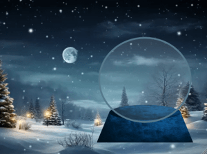
1. Using the internet, I used a cartoon snowy background. To remove the Vector Stock at the bottom< I simply crop it out from the photo. I also toggle lock the layer of this background (This is a good hack if you don’t want to select the background when combining shapes later on).


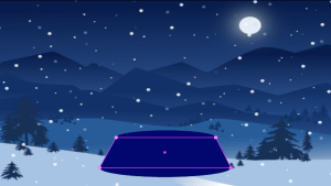
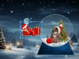
2. In order to make the stand I used two circles (one small and one big) and a rectangle. Using the curvature tool (I find this tool very helpful as it helps me create curves by connecting points), I extend the two bottom anchor points of the rectangle to the end of the bottom circle. In order to make the snow globe stand stick out from the background made the color of the stand a nice royal blue color (I love blue).


3. Using the Ellipse Tool I created a circle for the glass of the snow globe. To make that glass-like feeling I adjusted the opacity down to 15% with a grey 6 pt stroke as its outline. Finally, I combined the stand that I made with the glass.


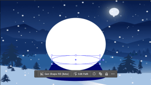
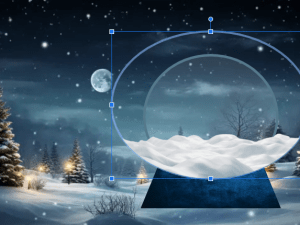
4. For this part, I will be making the snow in the globe. Using the Ellipse Tool, I created two circles; one similar to the shape of the snow globe; the other a small ellipse circle. I will be using white as my color as it is the color of the snow. In order to remove the excess part of the big circle, I used the selection tool to select both circles and finally, I used the shape builder tool to remove the top part of the circle, leaving only the bottom part. This will result for a pile of snow at the bottom of the globe, which is what I want to achieve. Lastly, I made the stroke for the small ellipse as 0.25 pt and moved this layer to the back of the glass for the globe. Doing this would make the snow look like it is in the globe.

Images Used:


————————

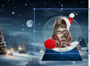
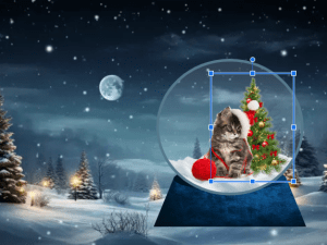
5. Using images online, I removed each image’s background. I used various Christmas theme images such as the cat with a Christmas hat, Christmas tree, and presents. In order to fit the cartoon concept of the background and the snowglobe, I made sure that the images I used were cartoon style which I find cute.

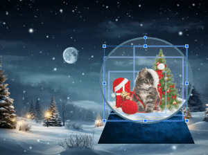
6. Looking at the image, it feels flat, so using the ellipse tool I added some shadows. I achieved this shadow look by first setting the color of the circles to black and turning down the opacity. Furthermore, for the bottom part of the snow, I made the color of the snow a darker white or light grey. Now that I added shadows to the snow globe, it looks better because the shadows added depth to the snow globe making it look 3d.

Image Used:

————————


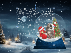
7. I wanted to add snowflakes inside the globe so I used a realistic snowflake from online. First things first, I removed the background using a website called “Remove Background“. Next, I pasted the snowflake image to Illustrator, and using the ellipse tool I created a circle similar to the globe; To select the image and the circle, hold shift, click the selection tool, and select these two. Then, right-click and select “Make Clipping Mask” (this would mask the image to the shape of the circle). Finally, to blend naturally the snowflakes into the globe, I turned down the opacity.

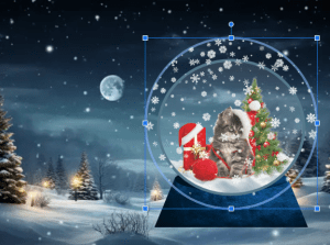
8. For the last touch, I added a highlight which shows the light reflecting from the moon. I did this by using the pencil tool and using the curvature to curve it along the circle. In addition, I also used the width tool to change the thickness of the strokes.

Test Results:

This is the final result of the Digital Outcome Test for Adobe Illustrator.

Advantages:

  • It has a wide range of tools for drawing, editing, manipulating shapes, etc. This is a great feature for me as it would allow me to create various graphic illustrations like when I made the snow globe structure.
  • I love the fact that Adobe Illustrator offers the user freedom and control because when I was using this app I was able to freely control the objects and layers like merging, grouping, locking, etc.
  • In terms of interface design, Adobe Illustrator has achieved one of Nielsen’s 10 Heuristics for Usability which is Aesthetic and minimalistic design. The app itself has an interface that is clean and organized. Each feature is placed within its own category which I find really helpful as it allows me to easily navigate the tools and features that I need to create the snow globe for this testing.
  • An advantage that I have observed when testing this app is that it passes one of Nielson’s Heuristics for Usability which is the Flexibility and Efficiency of Use. This is because common keyboard shortcuts like “ctrl + v” or “ctrl + c” are evidently used in the application which I find really helpful as it speeds up the time that I would take without these shortcuts.
  • For functionality, I think it passed my expectations. When using the application to make the snow globe, I was glad that all of the tools behaved and worked as I expected them to do. For instance, when I want to manipulate a shape, it does the job that I expected it to do.

Disadvantages:

  • One thing that I find a disadvantage of this application is that using the app was quite a journey and a challenge for me. For instance, I think I spent a total of three weeks just learning and getting used to the application’s features and tools. In fact, I have watched countless tutorials online just to learn the application.
  • The system requirements. During the testing, I had a total of 3 crashes because the computer that I am using cannot take the large and complex files that Adobe Illustrator is using. I find it as a disadvantage as it disrupts me when I am creating an illustration and it also has caused me to worry that my work might be saved.

Improvement and Recommendation:

  • I think it is important to improve the stability of the software as it would prevent the frequent crashes that I have experienced when using this app.
  • I recommend expanding on the range of the shapes; adding more curves, callouts, etc.

Conclusion:

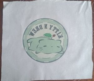
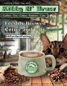
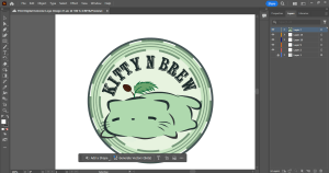
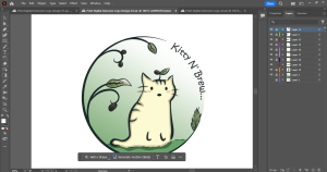
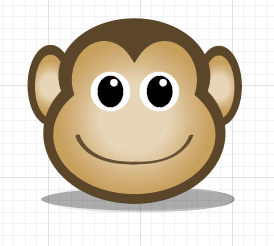
In my opinion, I think Adobe Illustrator is an application that is the best fit for making logos. This is because it has the tools that would allow me to create any shapes or objects that I want which is necessary in logo making. In addition, creating a logo needs to have its own original design which is why this Adobe Illustrator fits the best for this purpose. Furthermore, using this application would be the best fit for making a cat cafe logo which is one of my digital outcomes for this assessment.

Adobe Photoshop — Digital Outcome Test — Snow Globe —

Introduction:

Photoshop is quite good software for editing photos for business or personal purposes. Today, I will attempt to make a snow globe which is my digital outcome test for this software. I think my snow globe will be cat theme but Christmas since it is only four months left till Christmas.

I was going to try Google drawing first but I decided to go with Adobe Photoshop since it is the software I am most familiar with in Photo editing. Also, it will probably be quicker for me to finish one since I have more experience using Adobe Photoshop than the other software that I have tried.

Here are the Testing details:

  • Functional Testing – I will test the application’s functionality by verifying if all of the tools, features, and functions work as I expected.
  • Usability Testing – I will test the application’s usability by evaluating it using Nielsen’s 10 Heuristics for Usability.

Testing Documentary (Step by Step):


1. Using the pen tool, I will make a path in the globe where I will cut out and change the background. To make the path a selection, I will right-click and select “Make Selection”.


2. There are two steps I tried; One was using the eyedropper tool to get a sample of the color in the background and then using a brush tool, to color it inside the selection; the Second one was to use the generate fill tool and create a prompt which would produce a background in the snowglobe.


3. Using the internet find an object to put inside the globe. For this work, I will use a lynx cat as this cat is typically found in snowy places. To blend the image in the globe, I adjusted the color balance of the cat photo, moving the color towards cyan and dark blue. Doing this will make the image look natural in the photo. Additionally, I added some snowy pine trees to fill up the spaces around the cat.

Test Results


Looking at the results of this test, I decided to go with the one on the right.

Advantages:

  • It has a wide range of tools that allow me to effectively manipulate the image that I am editing.
  • I love the fact that you could generate a background that would contribute to the overall quality of the image. I believe this feature is quite an advantage as it would allow me to easily create a background that would fit the vibe of the original image.
  • Based on this testing, I believe the software itself functions really well. Its tools and features behave in what I have expected them to do. I can support this observation because in the testing documentary that I have made you can see that I was able to accomplish each step as each tool and feature that I have used functioned as what I have expected.
  • In terms of Nielson’s Heuristics for Usability, I think this software passed for me. Below are some of the Heuristics for Usability that are in the software: It has a simple and well-organized interface with each tool and each feature is placed within its own category (Aesthetics and Minimalist Design). Common Keyboard Shortcuts are used within the application which reduces the time and effort the user has to do when using the app (Flexibility and Efficiency of Use). The interface design is consistent as it is layout similar to the one in Adobe Illustrator which is one aspect that I like as it would not be a challenge for me navigating through the app as it feels familiar (Consistency and Standards)

Disadvantages:

  • Similar to the problems I had with Adobe Illustrator, I experienced frequent crashes when using the software to make the snow globe for this testing.
  • It requires a computer that would work well with large and complex files.

Improvement and Recommendation:

  • I suggest improving the stability of the application as it would reduce frequent crashes.
  • I recommend adding some advanced drawing tools to the application itself as it would contribute to the overall quality of the image that I am manipulating or editing.

Conclusion:

I think Adobe Photoshop is a great application for making print outcomes such as posters and infographics. It has the tools that I use to make my digital outcome. Furthermore, learning various techniques would also help me produce good quality digital print outcomes which is what I am trying to achieve at the end.

Chapter 3: Drawing

Today I finished the second image in the activity for Adobe Illustrator which is a monkey head. It was challenging at first since I had no clue on what to do to make the head of the monkey. However, as I went through and got familiar with the software, I learned the shape builder tool. It is a tool where you can combine different shapes to make a drawing. This was really helpful for me because it allowed me to easily make the monkey head. So, I finished making the monkey head and added a shadow at the bottom just like what the activity has shown.

Now that I have discovered and learned a new tool in this software. It will make it easier for me to do the next image which is a girl with headphones.